What time did your building startup last Thursday morning? It’s an important question, because deviations from plan are one of the first indicators of building drift. Thankfully, this is an easy question to answer for building operators using Snapmeter. For these operators, each week starts with an early Monday morning email report summarizing their building’s energy use from the week prior and forecasting any current billing period peak demand charges for the current week. In this “Pro tip” post, we’ll dig into Snapmeter’s startup monitoring functionality.

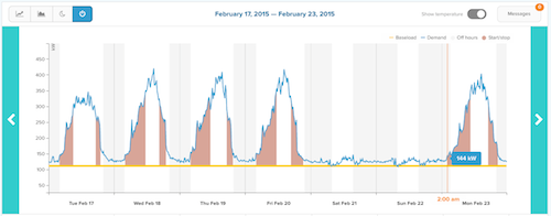
There are two things to look for in the graph above. First, notice the vertical gray bars of varying thickness? Those bars represent the time that Snapmeter’s machine learning algorithms have calculated as night and morning off-hours for the building. The algorithm calculates these medians based on the building’s own historical interval meter data, and by basing the calculation on a rolling 12 week period, it learns over time exactly how the building operates.
The second thing to spot is overlap between the building’s load curve (in blue) as it ramps up for any given day. Gridium’s tools are designed to be easy to use, so no squinting at that graph is needed. Instead, Snapmeter uses applied data science to interpret when the interval data changes from overnight baseload to daily startup. And when Snapmeter detects an early startup, an orange beacon is placed at the point of interest on the load curve to flag the potential issue:

Additionally, a note is entered into the Monday morning email that translates the potential issue into a dollar savings opportunity:

In addition to the weekly email reports, Snapmeter also provides a rich set of analytics online. These include toggles allowing the user to quickly visualize actual vs expected energy use, off-hours use compared to the building’s historical baseload, and startup/shutdown patterns. In the example below, Snapmeter highlights the startup and shutdown sections of the daily load curve, and it’s easy to spot when that shading overlaps with the vertical gray bars representing expected off-hours:

This is just one example of an easy way to spot building drift. In future “Pro tip” posts, we’ll cover Gridium features like hard-starts, actual vs. expected, and anomalous off-hours use. If you have any questions about Snapmeter or its startup/shutdown analysis, please let us know.
